A Zone for Better Health
Massage Zone
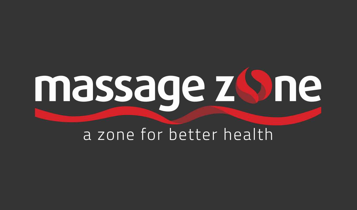
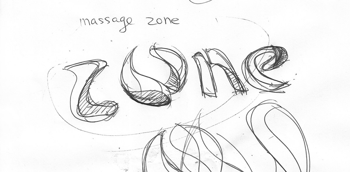
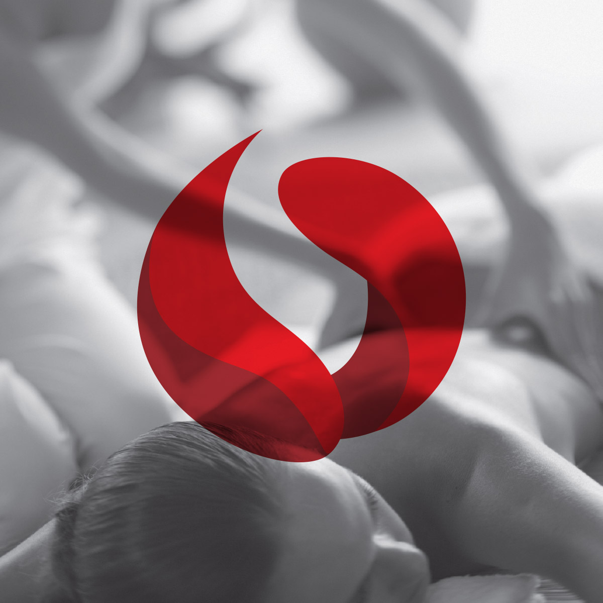
Our designers' start point is Taichi, that is considered as the core of the massage. This icon has been used in many industries already. We brainstormed some concepts first, then picked the one is representative and outstanding with the 3D looking.
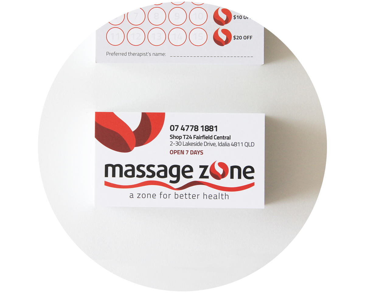
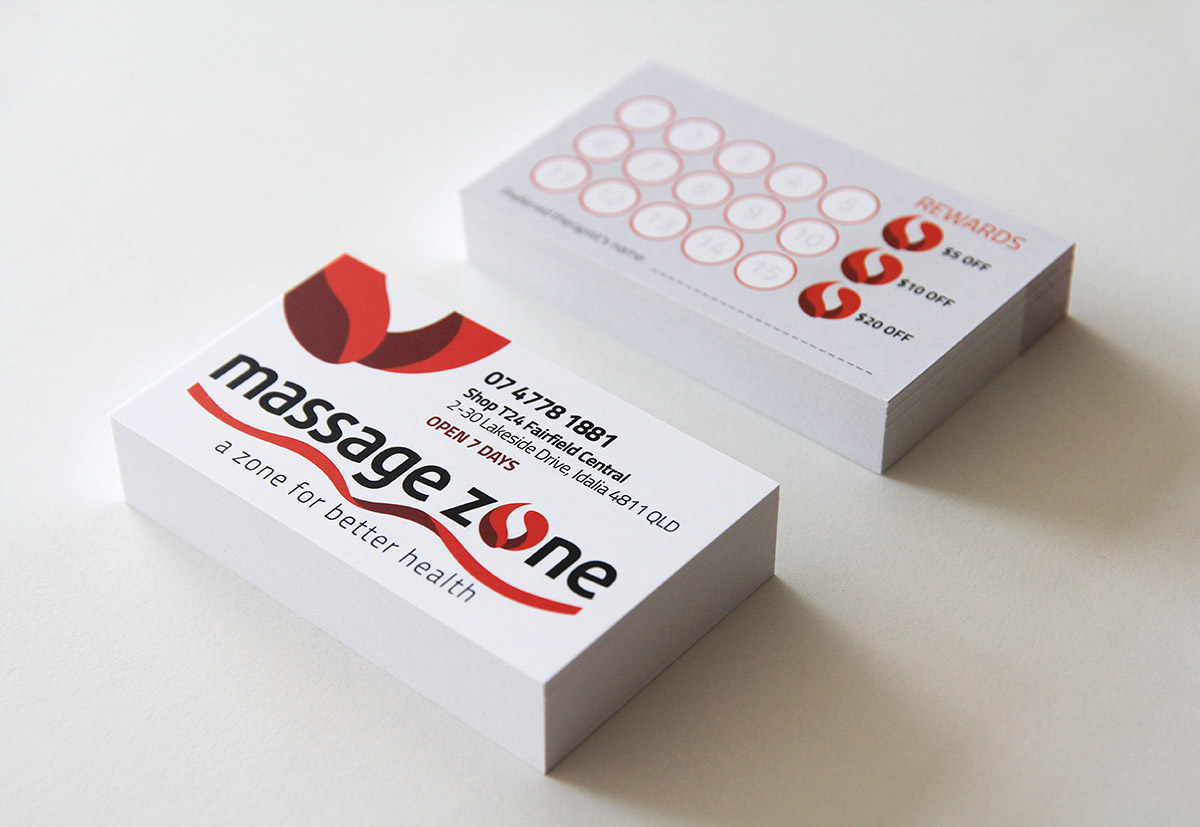
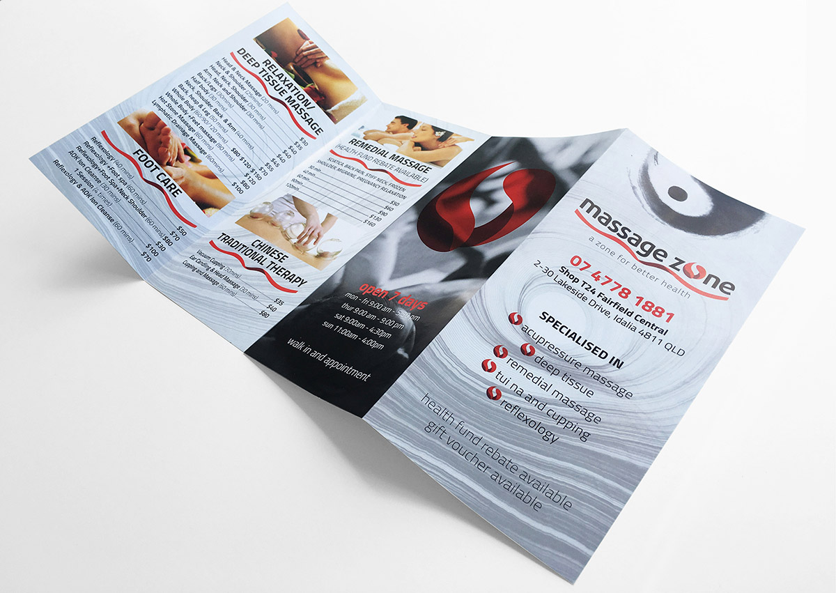
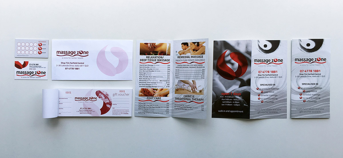
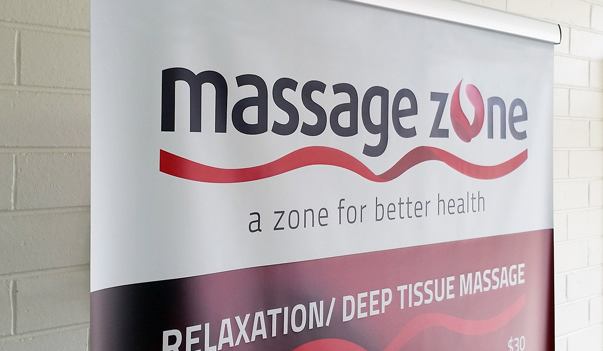
This concept shows two hands doing the massage and it is also a letter 'o', so it can be embraced where a full business name is used. It helps to keep the consistence of the business visual profile and versable to the appearance on different stationery (brochure, business cards, flyers), siganage (offce sign, pull-up banner).
